Learning Journal
Game Design Research
March 3, 2025Reading Juego Studio’s article on game design principles prompted me to reevaluate my approach to designing games. While I’ve always understood the importance of mechanics and structure, the article’s emphasis on player agency and ethical design shifted my perspective. I used to focus primarily on creating systems that were functional and engaging, but this article reminds me that the emotional and ethical dimensions of design are equally critical. Reflecting on games I’ve enjoyed, like Stardew Valley, I realized their success lies not just in their mechanics but in how they respect the player’s time and choices. Moving forward, I want to focus on crafting games that feel meaningful and respectful, not just entertaining.
Visual Thinking Analysis
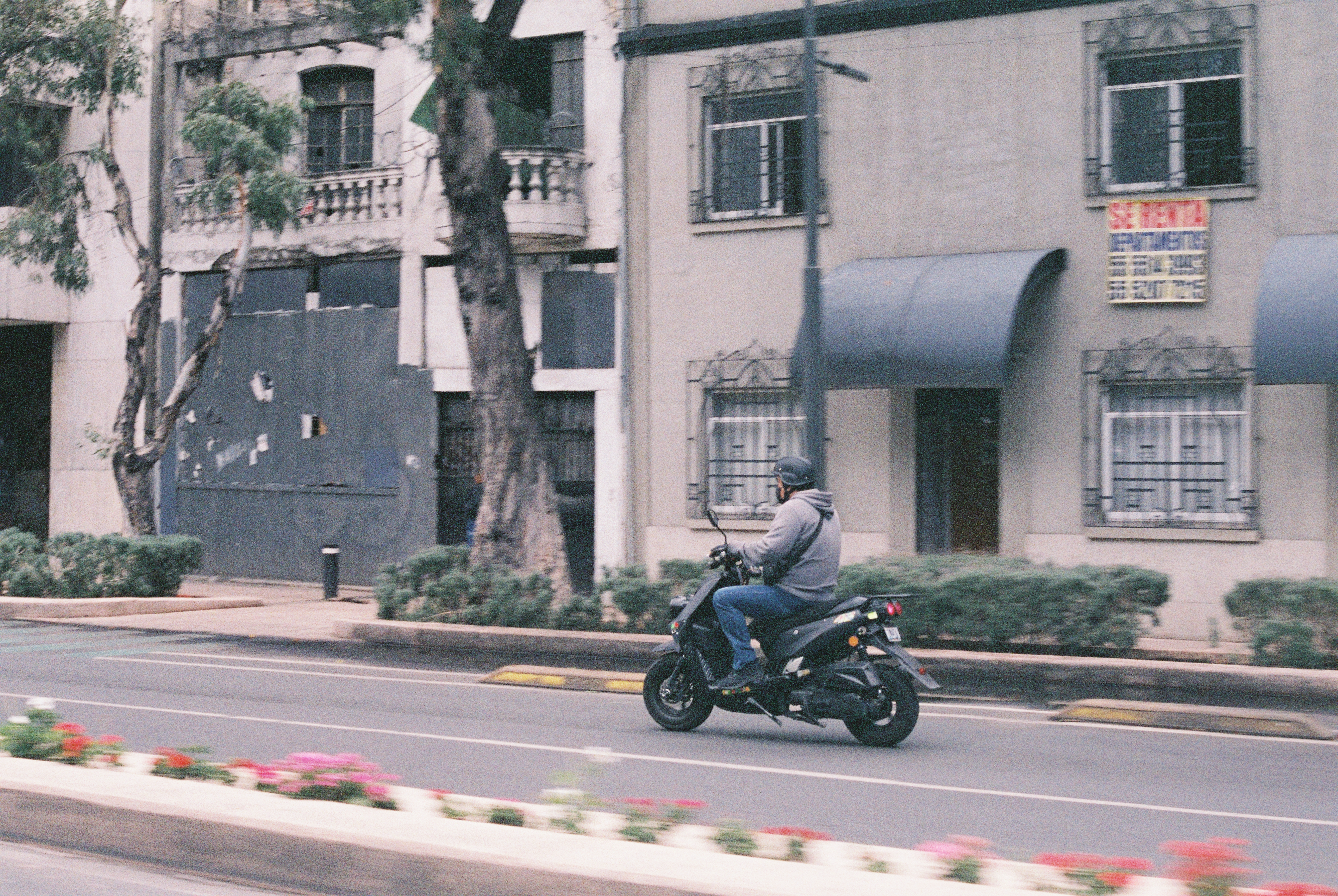
Feb 12, 2025The image by Shuailin Chen captures an urban scene where a man on a motorcycle rides past a worn-out building. It evokes the themes of movement, transition, and time's imprint on the built environment. The juxtaposition of the rider, who dressed in a neutral hoodie, against the decayed facade, creating a contrast between human dynamism and architectural stagnation. Meanwhile, the muted color palette enhances a sense of quiet melancholy and the motion blur in the background reinforces the idea of transience. To push this image beyond a straightforward documentary frame, I just emphasizing abstraction through framing and composition. For example, playing with depth of field, keeping the man in sharp focus while allowing the background to dissolve into shapes and tones. Also, since the image already has a dynamic motion blur, it could be emphasized with an effect that slightly elongates the rider's form as they move. And the muted tones could be enhanced by allowing selective colorization. For instance, the flowers could become more vibrant when the user scrolls or hovers over the image.
One of the images I am most excited about in my project is a night-time photograph of Chengdu. At first glance, the image presents a familiar scene of modern urban life, that illuminated by artificial lights and filled with movement. However, this image also speaks to Chengdu’s transformation, where rapid urbanization coexists with the lives of ordinary people who experience the city in different ways.
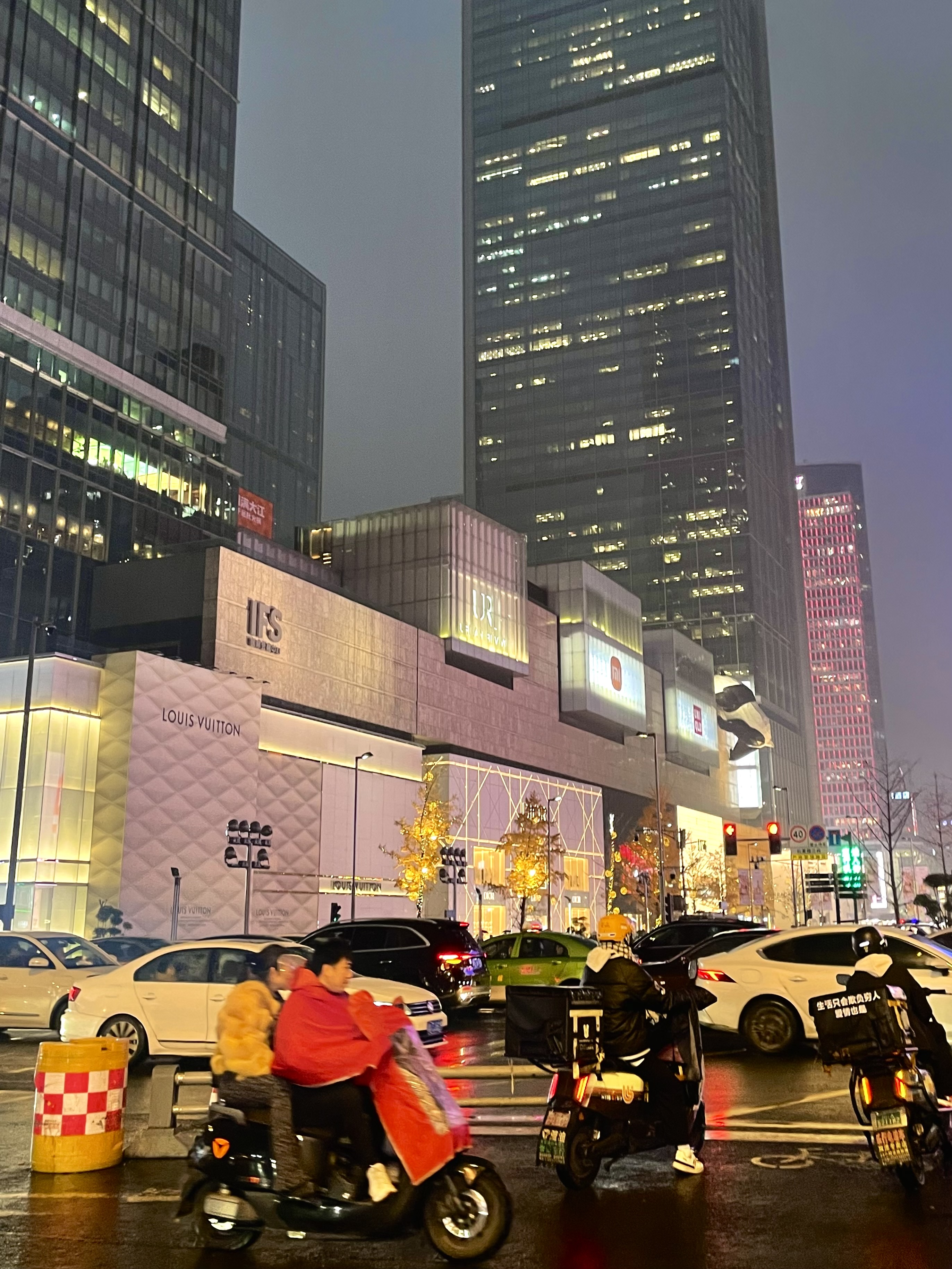
This image is significant to my project because it reflects my evolving memory of Chengdu, a city I now experience from a distance. My collection is not about documenting Chengdu as it is but about how it exists in memory. Being far away from the city alters my perception of it, and photographs like this serve as emotional anchors. To make this image more compelling, I’m considering a few interactive updates. First, I want to play with selective focus and blur, which allows users to “reveal” parts of the image as they interact, and mimicking the way memories come in and out of clarity. Additionally, I plan to integrate sound design, where clicking on different areas of the image triggers urban noises, for example the chatter of pedestrians. Ultimately, I want the design to transform the image from a simple photographic record into an interactive exploration of nostalgia and my personal recollection.
Visual Thinking Strategies Research
Feb 10, 2025The New York Times article about using photographs to teach close reading and visual thinking skills made me curious to search for ways to use images to inspire thinking. I found the website Where Giants Roam, which does visual thinking in a very creative and interactive way. The website presents its content through a creative mix of beautiful photographs and engaging animations, which invites users to explore the narrative behind each image. For example, when users hover over the images, the cursor changes correspondingly, guiding them to interact with the content and reveal hidden animations. The design not only enhances the storytelling experience but also encourages users to observe and interpret the visuals in a deeper way. In addition, all the interactive design components perfectly match the overall style of the website, and contributing to a cohesive and immersive experience.
However, the site can sometimes feel overwhelming, especially for new users who might struggle with the many interactive elements and navigation choices. Overall, while Where Giants Roam is a powerful example of innovative visual storytelling, a few improvements in user guidance and mobile optimization could make it even more accessible.
Research Form Design
Jan 20, 2025The article Best Practices for Form Design provides an overview of the essential principles that make forms user-friendly and efficient. And one part that stood out to me is the section on Accessibility. It talks about how important it is for designers to make sure everyone, no matter their ability, can use the forms we create. The actionable steps, such as providing proper color contrast, enabling adjustable text sizes, and incorporating labels, are useful for me as a reminder. And I also realized how much accessibility connects to empathy in design. For example, the advice to include labels for screen readers or not to rely solely on color to communicate status really need considerations go beyond our own experience and imagining how others might interact with what we created.
One form I think exemplifies these best practices is the sign-up page for Figma. What I like about it is how simple and easy it feels while still being thoughtful about different user needs. The form only asks for the most important information, which keeps it from feeling overwhelming. It also checks for mistakes as users type, so they can fix them right away without waiting to submit the form.
Overlays Design Pattern Research
Jan 30, 2025The NNGroup article Overuse of Overlays criticizes the excessive use of overlays in web design and explains how they can negatively impact the user experience. One important point in the article is about cognitive load and interruption. Overlays often require users to take immediate action, which can be annoying, especially when they appear suddenly or cover important content. This goes against usability and accessibility principles, which focus on making interactions smooth and easy for users. The article also points out major usability problems, such as users losing track of what they were doing, having trouble closing overlays, and feeling forced to interact with content they don't want. All these issues can make browsing frustrating.
From a UX design perspective, this article highlights the importance of using overlays only when they serve a clear purpose, instead of relying on them as a common engagement method. If overlays are necessary, they should appear at the right moment, be easy to close, and match the user's needs instead of being used for aggressive marketing.